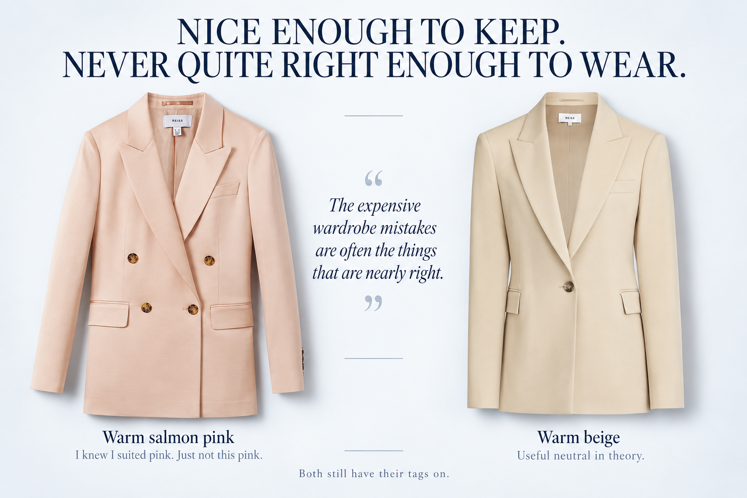
Somewhere in my wardrobe are two perfectly nice Reiss blazers. One is pink. One is beige. Both seemed like very sensible purchases at the time. Both still have their tags attached. At this point, I probably ought to admit defeat and put them on Vinted!
There is nothing obviously wrong with either of them. They fit. I like blazers. I know I look good in pink. The beige one seemed like exactly the sort of useful neutral that ought to work with everything. Yet neither ever made it out of the wardrobe.
I understand why now. The pink isn't really my pink. It's a warm, slightly salmon pink. The beige isn't really my neutral either. They're both perfectly good colours on somebody else, but on me they're just slightly... off.
Not terrible, which would actually have been more useful. If I'd looked dreadful in them, I'd have sent them straight back. Instead, they occupied that much more expensive category of wardrobe mistake: nice enough to keep, never quite right enough to wear.
Colour analysis has made me much better at spotting those clothes before they arrive at my house.
Why I had my colours analysed
I first came across seasonal colour analysis on TikTok. Like many things TikTok has introduced me to, I started out mildly curious and ended up doing considerably more research than was strictly necessary.
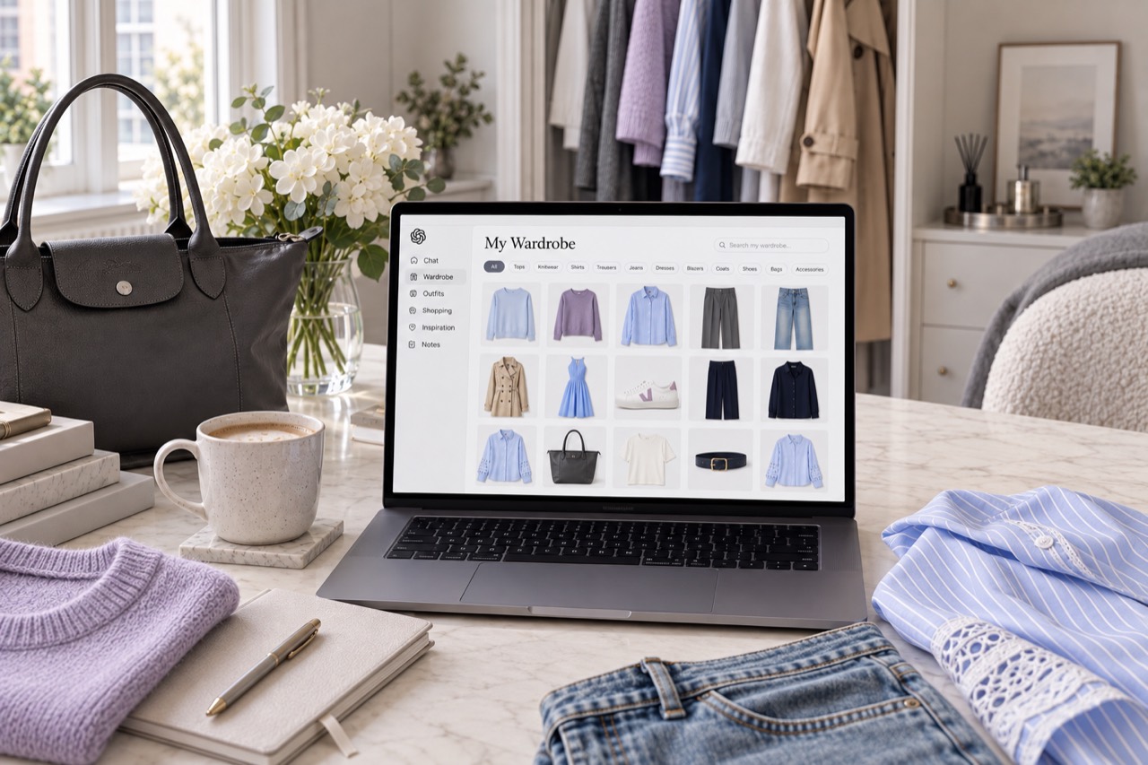
The timing happened to be particularly useful. I was preparing to return to work after maternity leave and needed to buy some new workwear. My body had changed after having a baby, so quite a lot of my old wardrobe simply didn't fit in the way it used to. I knew I needed a few new pieces, but I didn't want to replace things indiscriminately.
I also do most of my shopping online, which is wonderfully convenient until your hallway contains four enormous return parcels and you've somehow spent an evening printing labels for clothes you never particularly needed in the first place. I wanted to make the process more accurate. If I was going to invest in new workwear, I wanted to understand which colours genuinely suited me before I started ordering it.
That was really the objective. I wasn't looking for somebody to reinvent my personal style. I wanted better information.
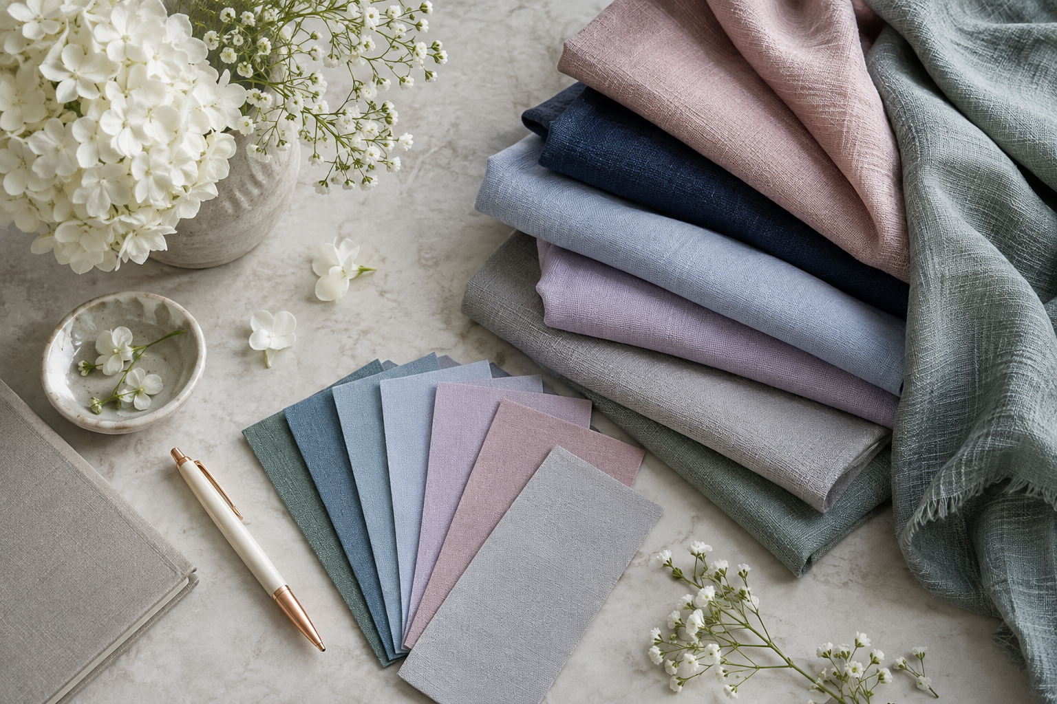
My result was True Summer: cool, relatively soft colours with a certain amount of depth rather than anything very warm, yellow or harsh. What surprised me wasn't that I had been getting everything completely wrong. Quite the opposite.
It explained why so many of the colours I had instinctively chosen for years already worked: cool pinks, blues, soft greys, berry tones, mauves and cooler purples. Even with makeup, I had naturally gravitated towards cool pink blush, berry lips and taupe eyeshadow rather than warmer alternatives.
So my colour analysis was less complete personal transformation and more evidence submitted in support of my long-standing case against warm tones. The difference was that I finally understood why, and that turned out to be much more useful than I expected.
Pink isn't just pink
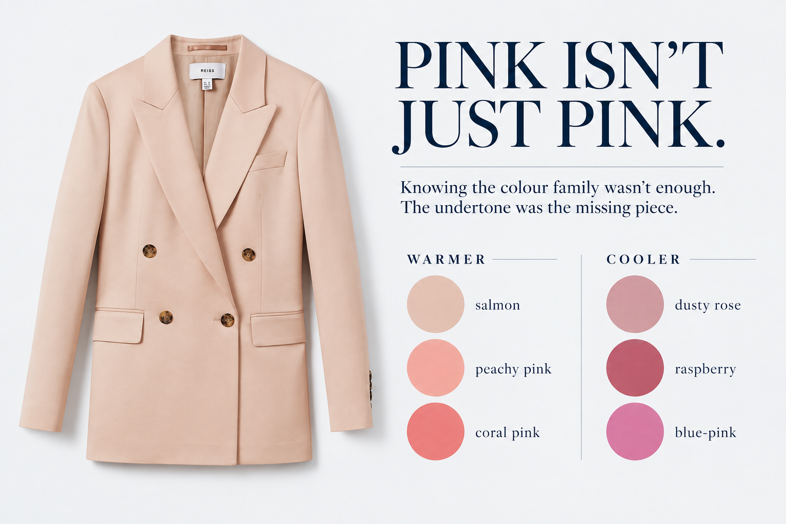
The Reiss blazer is probably the clearest example. Before colour analysis, I knew pink suited me, so if I saw a beautiful pink blazer online, the reasoning was fairly straightforward: I like the blazer. I suit pink. Excellent. Add to basket.
What I wasn't examining closely enough was which pink. A cool dusty rose, raspberry or soft blue-pink can look completely harmonious on me. Push the same colour towards salmon, peach or coral and something changes. The garment can still be beautiful. It can still fit perfectly well. I can still technically wear it. I just don't particularly want to.
That is what happened with the blazer. It arrived and it was... fine. Not send this back immediately bad. Just not I cannot wait to wear this good. Apparently my response to this ambiguity was to keep it indefinitely with the tags attached, which I cannot particularly recommend as a shopping strategy.
The beige blazer suffered much the same fate. In theory, a beige blazer sounds wonderfully useful. In practice, that particular beige does very little for me. Once again, it wasn't sufficiently awful to trigger an immediate return. It simply never won when I was choosing what to wear.
Those two jackets have probably taught me more about colour than any perfectly chosen purchase ever could.
Shopping online became much easier
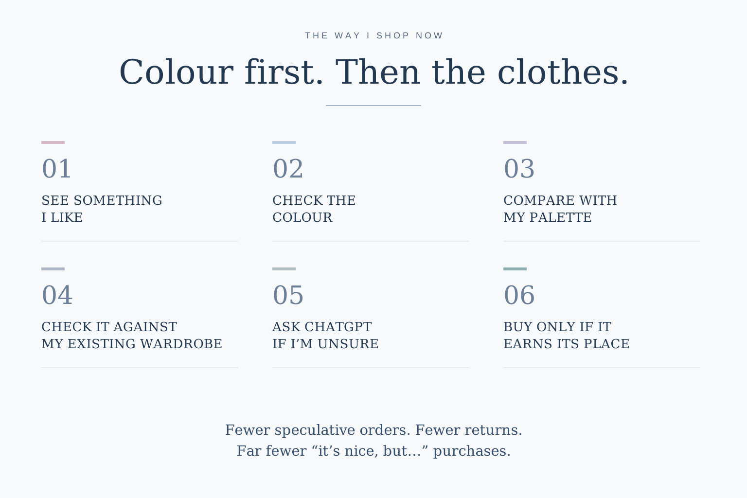
Now, colour is one of the first things I look at, rather than something I consider after I've fallen in love with the garment. I often filter by colour when I'm shopping online. If something catches my eye, I'll look closely at whether the shade appears warm or cool and compare it against my True Summer palette. If I'm unsure, I will often take a screenshot and put it into ChatGPT so we can look at the colour in the context of my palette and the wardrobe I already own.
Product photography isn't infallible, obviously. Lighting, editing and screens can all alter colour, so I don't pretend that I can determine the exact undertone of every garment from three pixels on a retailer's website. But I am far more discerning before I order, which means fewer speculative purchases and, importantly for somebody who shops online most of the time, far fewer returns.
It also means I'm no longer evaluating a purchase in isolation. The question isn't simply Do I like this? It's also: Is the colour right for me? Does it work with the things I already own? Will it sit harmoniously in my wardrobe? Can I actually see myself reaching for it?
That extra layer of scrutiny has made my wardrobe considerably more cohesive.
Colour analysis actually gave me more colours to wear
This is the bit I think gets missed when colour analysis is presented as a list of things you're no longer allowed to buy. It expanded my wardrobe in some ways.
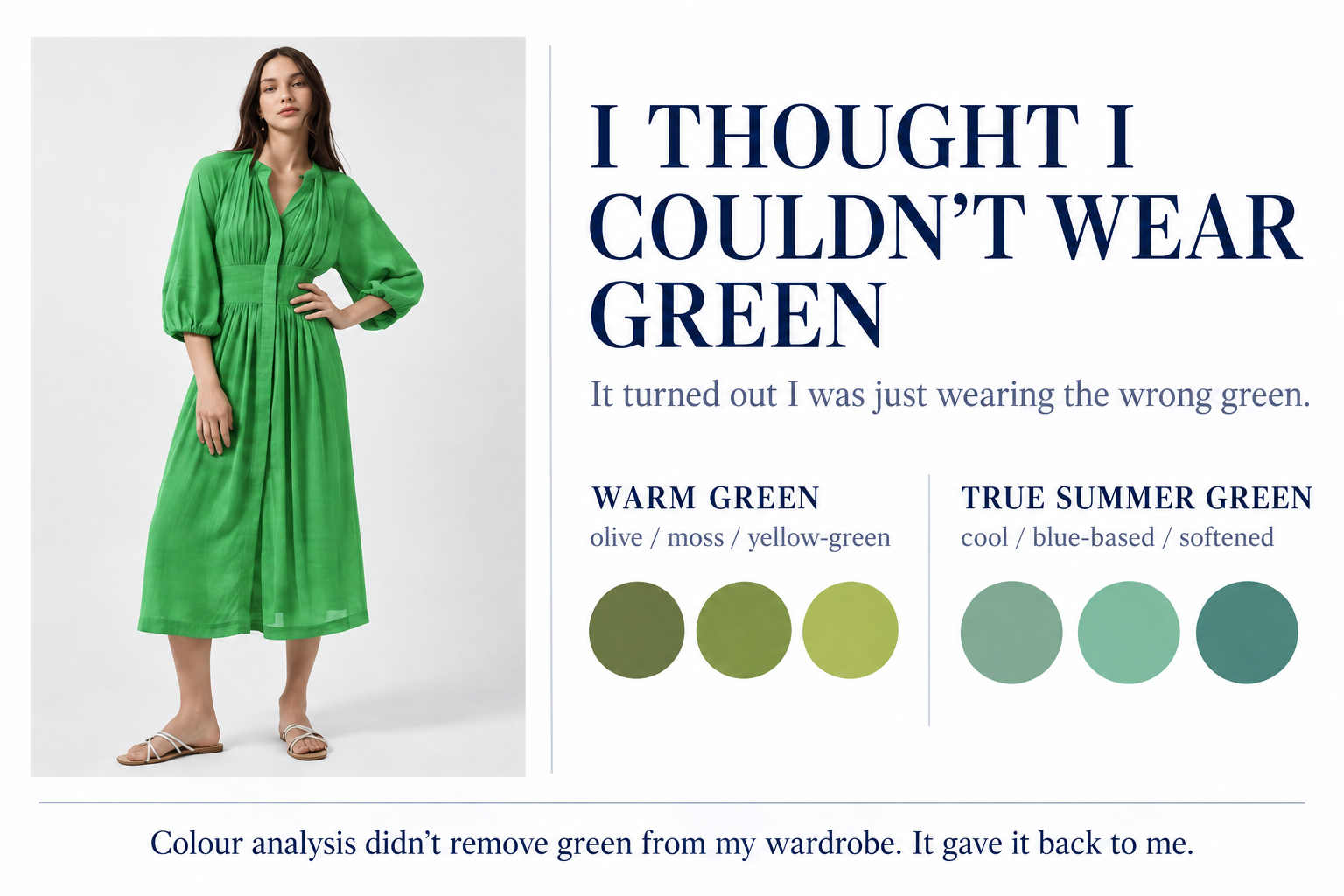
Green is the perfect example. For years, I had more or less concluded that I couldn't wear green. I would see green clothes in shops, hold them against myself and think, No. Absolutely not. The problem wasn't green. The problem was that many of the greens I happened to encounter were warm: olive, khaki, mossy or yellow-based greens. Those are not my best colours.
My husband once wanted to buy me a green French Connection dress. It was a lovely gesture and a perfectly nice dress, but the green was warm. I knew I wasn't going to wear it, so I gently asked whether I could exchange it. Previously, I might have filed that experience under Emma-Kate does not suit green.
Now I know that's not true at all. Give me the right green (cool, softened and blue-based) and suddenly it works beautifully. I wear green now.
That feels much more useful than being told I have a restricted list of approved colours. Colour analysis didn't remove green from my wardrobe. It gave it back to me.
I did, however, break up with quite a lot of black
Black is one of those colours we're often told everybody can wear. I cannot say that my True Summer analysis has supported this theory.
I had quite a lot of black in my wardrobe before, and I gradually removed most of the pieces I wore close to my face. Once I could compare black with softer navy, charcoal, cool grey and other colours from my palette, the difference became fairly obvious.
That does not mean I have conducted a ceremonial removal of every black object from my home. I still own black heels. I also bought a pair of black LK Bennett boots before the company shut down, and I have no intention of apologising for them. They are on my feet. Unless somebody is conducting my colour analysis while lying on the floor, I think we're going to be fine!
That is probably the level of devotion to seasonal colour analysis that suits me. I use it as useful information, not legislation.
A more cohesive wardrobe and an unexpected confidence boost
Once I started buying within a more consistent palette, something else happened almost by accident: more of my clothes worked together.
That sounds obvious now, but it wasn't something I'd fully appreciated beforehand. When colours share a similar temperature and level of softness, combinations become easier. A new knit works with several pairs of trousers. A blouse works under more than one jacket. Shoes and bags make sense across multiple outfits. I wasn't consciously trying to build a capsule wardrobe. I was simply making fewer purchases that fought with everything else.
The result was a wardrobe that felt calmer and much easier to use. That mattered particularly when I was returning to work.
Returning to the office after maternity leave is a strange transition. Your life has changed enormously. Your body may have changed. Clothes that used to be completely straightforward suddenly aren't. At the same time, you're stepping back into a professional environment where you want to feel like yourself again.
I needed new workwear because some of my old clothes no longer fitted, but what I gained wasn't simply a replacement set of trousers and jackets. I started putting outfits on and feeling really good in them.
Other people noticed too. I had always received compliments on the way I dressed, but after the colour analysis the comments became noticeably more specific: “That's such a lovely colour on you.” “That really suits you.” “It brings out your eyes.”
Those comments weren't the reason for doing it, but they reinforced something I was already noticing myself. The colours looked harmonious. I felt more polished without necessarily being more dressed up. At a point when I was finding my way back into professional life after having a baby, that little boost of confidence was genuinely valuable.
Buying less without making shopping miserable
I was already fairly considered about shopping. I've never been someone who wanted enormous quantities of cheap clothing for the sake of having something new. Even so, I made mistakes. The two Reiss blazers sitting upstairs with their tags attached are available as Exhibit A and Exhibit B.
What colour analysis has done is make those mistakes less frequent. I don't need to order five versions of something to work out which one suits me. I don't persuade myself that a warm colour will probably be fine because I like the garment. I don't assume an entire colour family doesn't suit me because I've repeatedly tried the wrong version of it.
I look more closely. I buy fewer things that are almost right. When I do add something, I want it to work with the wardrobe I already have rather than requiring three more purchases before I can actually wear it.
That is what buy less, buy better means to me in practice. Not never shopping. Not owning fifteen beige garments and calling it minimalism. Not feeling guilty because I bought a beautiful pair of boots. Just making better choices more often.
Useful information, not a set of rules
There are people who have colour analysis done and immediately remove every non-compliant colour from their lives. That isn't me.
If you own something you love and feel fantastic wearing, I cannot imagine a persuasive argument for getting rid of it because a colour fan says otherwise. Colour analysis is information. For me, very useful information.
It has helped me understand instincts I already had, identify mistakes I couldn't previously explain and become much more accurate when shopping online. It has also stopped me concluding that I can't wear an entire colour simply because retailers keep producing it in the wrong undertone.
Most importantly, it has made getting dressed easier. My wardrobe works together better. I return less. I make fewer expensive “it's nice, but…” purchases and I feel more confident in the colours I wear.
Which brings us back to those two Reiss blazers. They really are very nice.
They are also still wearing their tags.
I think it's time for Vinted.